Computer Science
Visualization helps science to see the unexpected
Advances in how science is presented means that visual tools can inspire research, as well as make its results accessible to the world.


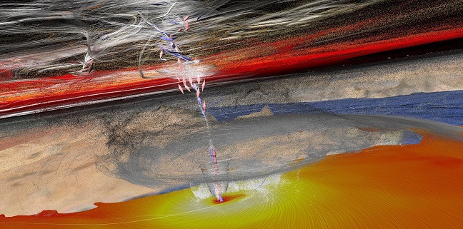
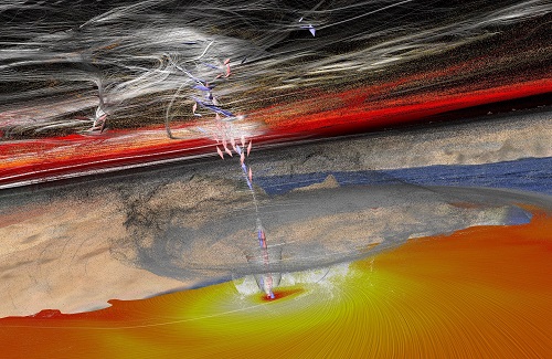
Visual tools can help us to scrutinize our surroundings, direct our research and bring new discoveries to the masses. This image is a storm simulated by KAUST’s Visualization Core Lab.
© 2017 Visualization by Thomas Theubl: similar by Hari Prasad Dasari; Ibrahim Hoteit.
There’s a certain beauty to data. Whether it’s an infographic on research collaboration or a complex map of genomic data, the interplay between variables is often better appreciated from a visual display than from a table of numbers.
But the utility of these tools goes beyond the production of aesthetically pleasing graphs. Enabled by more powerful technology, scientists at KAUST are increasingly considering how graphic analysis can benefit their studies1.
KAUST’s Visualization Core Laboratory is home to state-of-the-art visualization, interaction and computational resources that allow researchers to present and explore scientific data. Their expertise is anchored in data analysis and visualization, both key elements of the scientific process, enabling researchers to evaluate their experiments and to ask new questions that could lead to discoveries.
Visualization as a core analytical tool
Daniel Acevedo-Feliz, former Director of the Visualization Core Lab, says their work helps scientists to “see the unexpected,” through audiovisual experiences that literally immerse researchers in their data and understand it in a new way. For example, one group of researchers approached the lab staff with their model of salt deposition in turbulent waters. When scientists in the lab recreated the model on-screen, the researchers realized they had overlooked a potentially important aspect of how the process works in the real world.
Visualization can also be used to validate research, as was the case with Ibrahim Hoteit, whose researchers brought their storm model (see image) to the Visualization Core Lab, where the team used it to simulate a real storm from 2015 and compare it to how the storm actually played out on satellite imagery. “We put them side-by-side…and it really tracked. It was in the position that it actually happened. That was a good result,” says Acevedo-Feliz.
Diving into science
With the advent of high-definition virtual reality, scientists now have the ability to get up close and personal with their research. “One of the key elements we use is not just the visuals but interaction,” says Acevedo-Feliz, describing how the researchers utilize the KAUST Virtual Reality (VR) advanced facilities.
“They use interaction as the main tool for them to discover potentially interesting things. They get the data from the microscopes, slice it, reconstruct it and then come to the Visualization Lab to use the VR facilities because this provides them that extra insight into complex phenomena.”
“Changing the perspectives also changes the way scientists approach the data,” says Acevedo-Feliz.
In this way, visualization transcends being just a way to display research, to be a real tool for discovery. With VR, visualization can take data from the wall or the page and bring it to life in 3D.
Taking science from the page to the public
While the primary focus of the Visualization Core Lab is to facilitate the work of academics, Xavier Pita then takes this and distils the key elements into a medium that can be easily understood by nonspecialists. “It’s an important step—to get that information to the audience,” he tells the audience. “We feel that communication is more efficient—more effective—if people are drawn into it;” highlighting the importance of having a clear, immediate message. “Is it readable? Understandable? Can it stand on its own?”
The process of constructing the perfect scientific illustration is highly collaborative. Offering an inside view into his process, Pita describes collaborating with a research colleague to produce an image that contrasts plant growth and water evaporation with and without the use of water-repelling sand. As the scientist explained the process, Pita would translate the words into imagery on paper.
Acevedo-Feliz agrees with the importance of collaboration: “They [the scientists] give me a USB stick and say ‘visualize that’—and I’m like ‘no, I can’t! I don’t know what that means.’”
Science as art; art as science
Offering a different viewpoint is Tamara Jones, a freelance artist residing at KAUST. As she puts it, hers is the world of shape, form and proportion.
While Jones’ art and the visuals of Pita and Acevedo-Feliz may not be directly related, they all agree that they use the same fundamental palette. They rely on the judicious use of shape and color, and most importantly, they work to convey message and meaning to their target audience.
Each perspective represents a different, yet highly important step in the process of discovery, explains John Tannaci, KAUST’s Director of Research Operations. Jones explores what’s out there to be looked at, Acevedo-Feliz explores these things to find new research directions, and Pita helps to convey the science to audiences in the most accessible way possible.
References
- This article is based on a Sci-Café event at KAUST: How do we use human perception to incite the understanding of data?
You might also like

Applied Physics
Colorful solution to advanced disease diagnosis

Bioscience
Can AI finally bring order to biology’s data deluge?

Computer Science
AI-based hydrogen plant models improve power grid stability

Bioengineering
Bio-inspired network structures for next-generation AI

Computer Science
Green quantum computing takes to the skies

Computer Science
Probing the internet’s hidden middleboxes

Bioscience
AI speeds up human embryo model research
Computer Science