Applied Mathematics and Computational Sciences
Getting a visual on complex data
A new method for visually presenting complex data distributions provides a much-needed tool for management, analysis and interpretation.


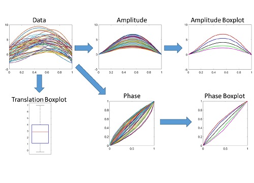
A new box-plot method makes sense of functional data (top left) by deriving summarized statistical functions for amplitude (top right) and phase (bottom right) along with a conventional box-plot for translation (bottom left).
Reproduced with permission from reference 1 © 2016 Taylor & Francis
As it becomes easier and cheaper to monitor and record information at ever-finer resolutions in time and space, the data sets used by scientists, engineers and managers become larger and more complex. This complexity renders inadequate the tools traditionally used to visually summarize data. Now a KAUST researcher has helped to devise an analogous approach to data visualization that promises to make even complex, multidimensional data sets more accessible and informative.
“As technology advances, the measurement of complex data that varies over time or space is becoming prevalent in many fields, including medicine, ecology, biology, biometrics, bioinformatics, computer vision and finance,” said Ying Sun, Professor of Applied Mathematics and Computational Science. “There has been much progress in the development of statistical analysis tools to handle complex data; however, much less attention has been given to visualization, which is an integral step in exploratory data analysis.”
A box-and-whisker plot is a conventional visualization that involves calculating five key statistical metrics for a classical one-dimensional data set, such as the heights of a population of people. These metrics provide the average, 25 and 75 percentiles, minimum and maximum, which can then be displayed on a chart as a box centered around the average with whiskers extending to the maximum and minimum. This enables quick and intuitive interpretation of the data without the need to understand or to analyze the underlying data.
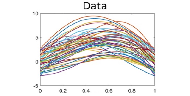
Sun collaborated with Sebastian Kurtek, a Professor from Ohio State University, and other colleagues, to apply this idea to data with a similar distribution but that had been measured over space or time; for example, daily sea-surface temperatures across many different locations. In this case, a continuous line or function of temperature variation can be drawn across all locations for each day, and plotting the data set for an entire year will result in 365 such lines drawn on one graph1.
The team developed a box-plot-like visualization by analyzing important characteristics of each function–the translation or offset in the data, the amplitude and the phase or overall shape of the function.
“Our method involves calculating a new version of the five-metric summary as a function, but we do this separately for the translation, amplitude and phase of the original function, which results in a much more meaningful visualization,” explained Sun (see image). “Our method can identify signals, such as El Nino or La Nina events based on sea-surface temperature, or other patterns, like a heart attack based on echocardiogram traces.”
References
-
Xie, W., Kurtek, S., Bharath, K., & Sun, Y. A geometric approach to visualization of variability in functional data. Journal of the American Statistical Association advance online publication, 24 October (2016). | article
You might also like

Applied Mathematics and Computational Sciences
Resilient renewable energy networks designed for the desert

Applied Mathematics and Computational Sciences
Smarter MRI image analysis for the whole heart

Applied Mathematics and Computational Sciences
Realistic scenario planning for solar power

Applied Mathematics and Computational Sciences
Bringing an old proof to modern problems

Applied Mathematics and Computational Sciences
Accounting for extreme weather to boost energy system reliability
Applied Mathematics and Computational Sciences
Past and future drought patterns across the Arabian Peninsula

Applied Mathematics and Computational Sciences
New pattern for underwater resonators

Applied Mathematics and Computational Sciences